MODERN TRADITIONAL
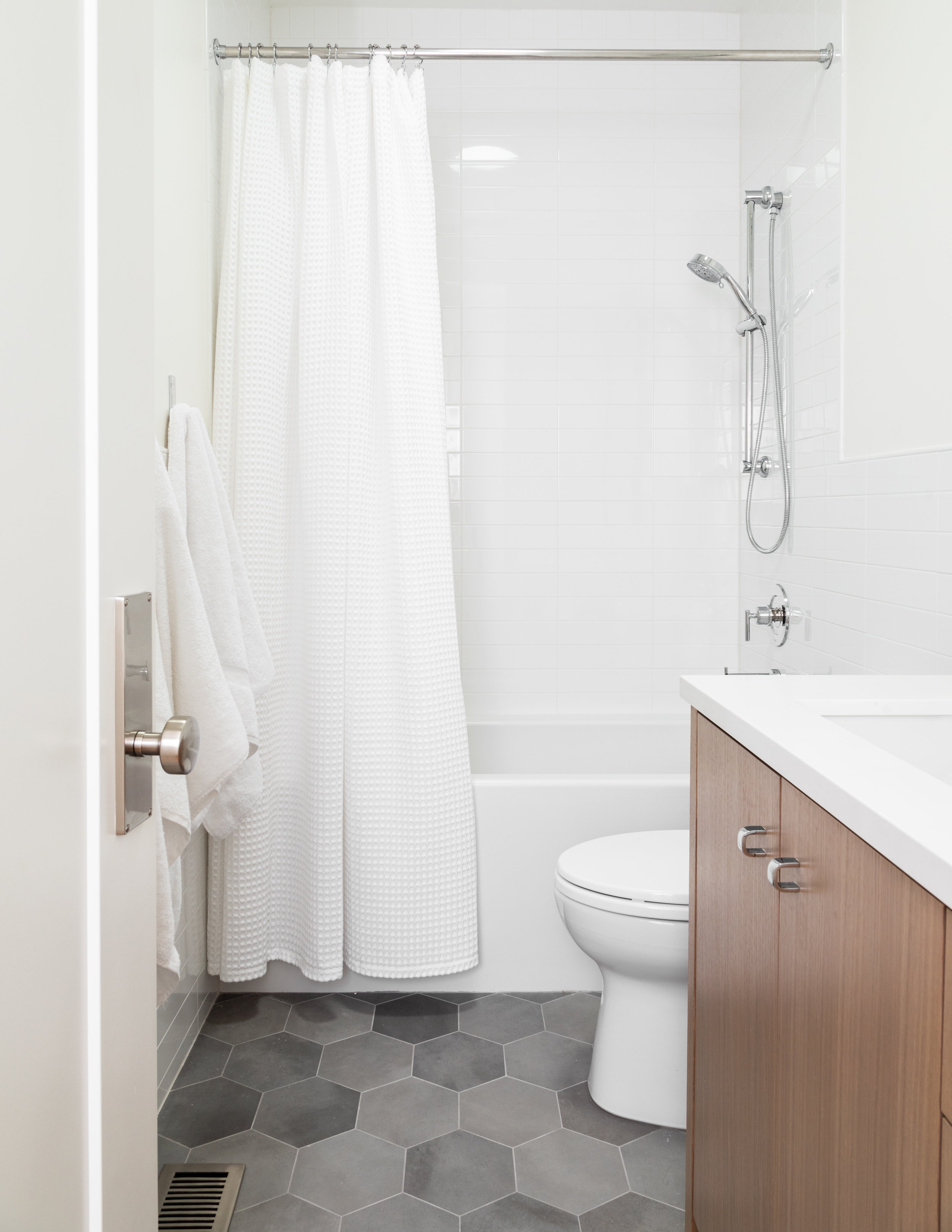
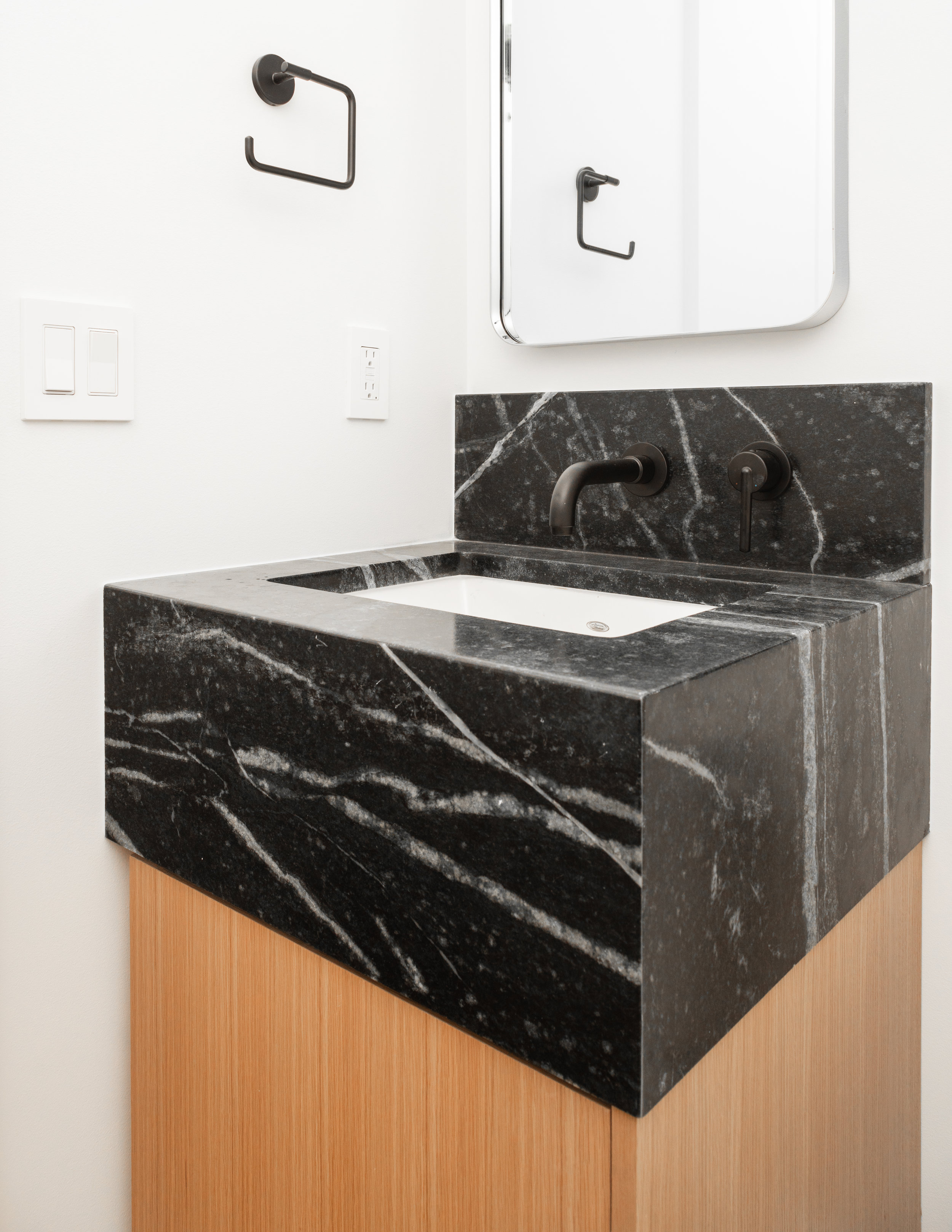
We focused on simpler architectural detailing for a subtle, lower-contrast context. We kept the profiles and proportions generally quite traditional, but simplified the forms to update the look. The key features that get contrast are in smaller quantities but have impact. We custom designed many details to give the homeowners a one-of-a-kind space that really speaks to their personalities. Many functional changes were made to the floor plan, and we used lots of cabinetry to get the most out of the revised spaces.


This home (and its family) is practical. We didn’t expand the footprint by much, but what mattered most was an improved allocation of square footage where it made a difference.
By keeping square footage additions to a minimum, it allowed for investment into some higher-end finishes and design details like custom baseboard & casing, one-of-a-kind newel posts, inset cabinetry in key locations, and solid hardwood flooring. We got creative with storage needs and added a few new doorways to create a circular flow throughout the home. Relocating the kitchen toward the center of the home afforded larger windows without sacrificing unobstructed interior walls for cabinetry.
We filtered all design ideas through the idea that if everything is special, then nothing is special. Details are subtle but, when considered as a whole, support each other in the understated design language. We kept the larger design statements to a minimum to avoid a theatrical feeling.
Remodel plans created while working for Tiek Design Group.
Architectural Interiors by Anson Fillerup Design
Construction by Beehive State Builders
Photography by Allison Niccum Photography
Inset Cabinetry by Christopher Scott Cabinetry
Overlay Cabinetry by Mountain Crest Cabinet


